Where are Filipinos moving?
I found the PSA's internal migration dataset to be hard to work with, so I wrote another one. It uses public government data and the residual method, which is a fairly basic method to estimate demographics. This work was inspired by Tobi's work on OpenHalalan (stay posted; Tobi, Quintin, Ignacio, and I have some upcoming work on estimating the economic effects of flood control projects). My website is here, and my Google Scholar is here.
Who gained and who lost people since 2020
The census counted everyone in May 2020 and again in July 2024. Where a town grew faster than its own births and deaths can explain, people moved in. Where it grew slower, or shrank, people moved out. Blue = people moved in, red = people moved out. Hover over any town for its numbers.
Gray means no estimate could be published, mostly because a boundary changed between the two censuses. Rates are people gained or lost per 1,000 residents per year.
The same map since 1960
Town-level birth and death records only begin in 2017, so the migration estimate above cannot be computed for earlier decades. Census counts, however, go back to 1960, and this answers a simple question: which places grew faster than the country as a whole, and which fell behind? However, this confounds migration with local differences in birth rates, so it's a rougher estimate than our data above. But large effects are still pretty clear, such as growth rates in Mindanao in the 60s and 70s, and the long pull towards Manila and its suburbs. The small maps below show all eight windows at once; click one to explore it in detail, or press play.

What the data shows
1 · People move toward the capital, but around it rather than into it
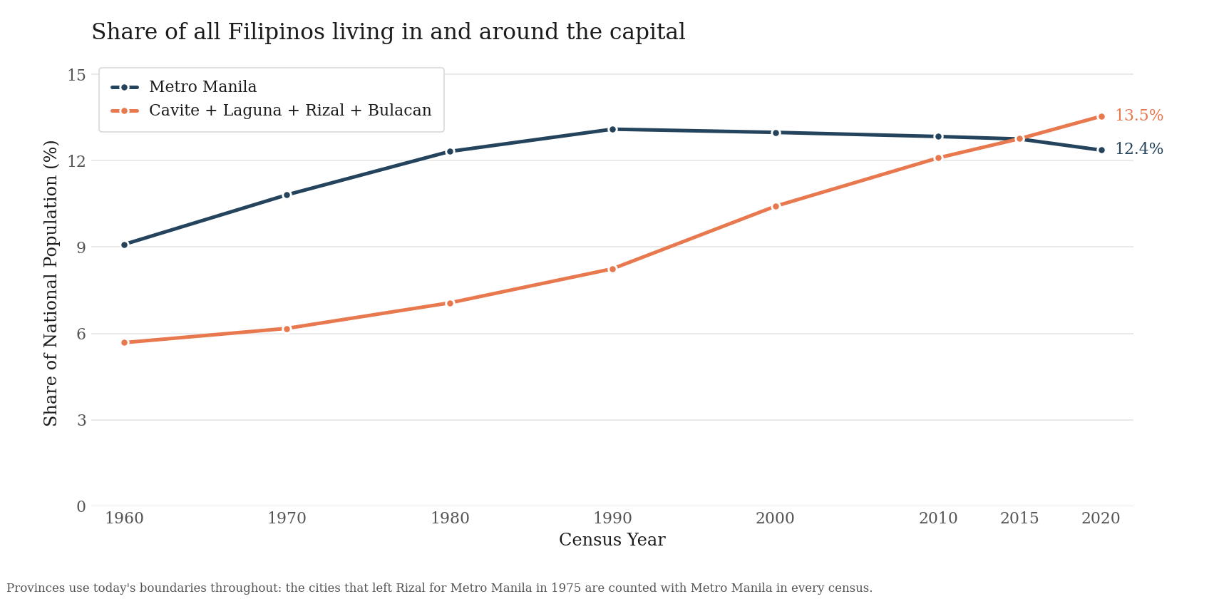
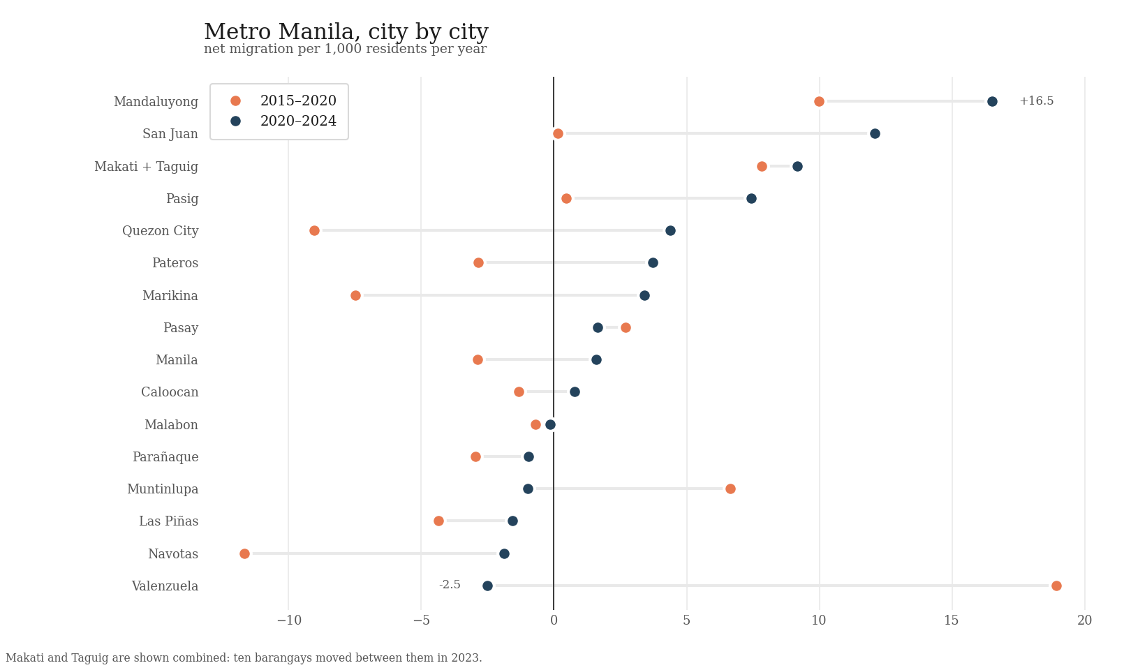
This is the longest-running pattern in the data. Cavite, Laguna, Rizal, and Bulacan, the four provinces around Metro Manila, more than doubled their share of the national population over sixty years, and between 2015 and 2020 they overtook the capital itself. The flows behind that are large: in 2015–2020 Cavite alone gained almost half a million people net (24.6 per 1,000 residents per year) while core cities like Quezon City lost people.
2 · After 2020, the map rearranged
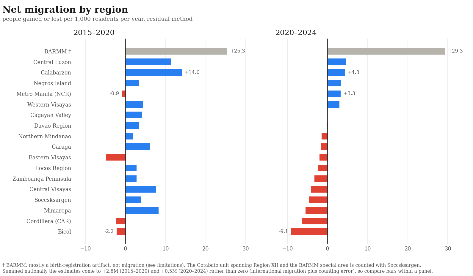
The newest census window changes the ranking. The capital region flipped from losing about one person per 1,000 per year to gaining 3.3. Ten of its sixteen cities gained people, up from seven in 2015–2020. Meanwhile several regions that had been gaining (Mimaropa, Soccsksargen, Central Visayas) flipped to losing, and the Bicol region lost more people relative to its size than any other.
3 · Disasters push people out late, not immediately
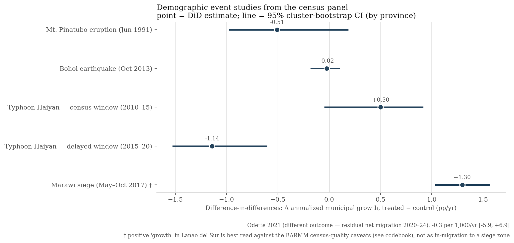
Typhoon Haiyan's landfall corridor grew at a normal rate in the census window that contained the storm, then fell 1.1 percentage points a year behind comparable towns in 2015–2020. The population cost arrived after the emergency ended. Mount Pinatubo shows the same signature stretched over the 1990s. The Bohol earthquake, after which reconstruction was fast, left no visible mark at all.
How the estimates are made
A town's population can only really change for three reasons: people are born, people die, or people move. We have some information available to us which can rule out the first two: a census gives us the population at two dates, and the civil registry gives us births and deaths in between. So whatever part of the change is left over after births and deaths must be migration. This is called the residual method, and it is a standard demographic tool: the same logic is used to estimate populations that no survey can count directly, like undocumented immigrants in the US census (Warren and Passel 1987; Demography 2021).
For example: a town counts 10,000 people in 2020 and 11,000 in 2024, and its registry shows 1,500 births and 400 deaths. Births and deaths explain a gain of 1,100, but the town only gained 1,000. The difference, 100 people, is the number who moved away on net.
Most of the work here is bookkeeping, since I found the PSA census data hard to work with. Files are scattered across sites and formats, and it's kind of mind-boggling to keep track of all the changes in name, category, etc. In this dataset we do our best to track every such change since 1977 so that each town is compared with itself, and you get neat longitudinal comparisons.
Of course, such a method inherits the flaws of its inputs, as births and deaths that are never registered end up being counted as migration.
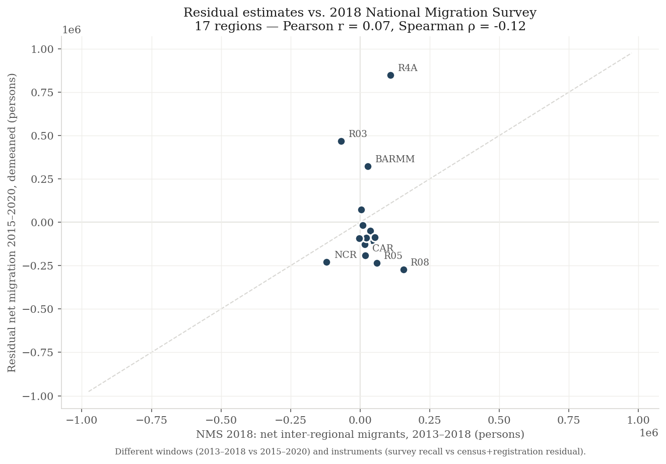
Where the estimates are weak
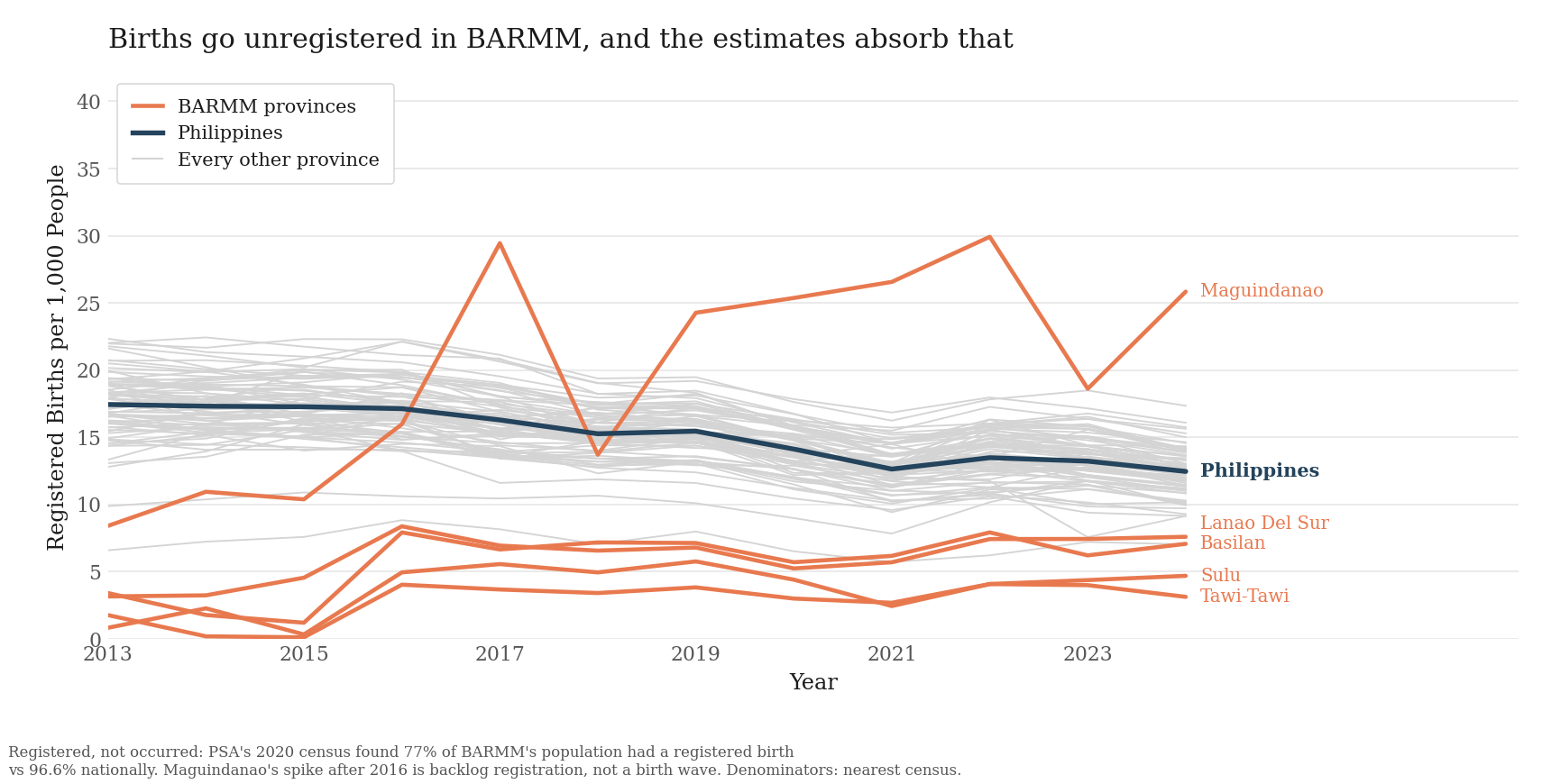
Two more things to keep in mind. First, the estimates do not sum to zero across the country (+2.8 million for 2015–2020, +0.5 million for 2020–2024). The remainder absorbs international migration, unregistered births and deaths, and differences in how completely the two censuses counted, so comparisons between places are more reliable than any single town's level. Second, small towns have noisy estimates; rows with rates beyond ±50 per 1,000 per year are flagged as extreme in the data.
What you can do with this, and what is still missing
Things the dataset can answer today:
- Which towns are growing because people are arriving, not because of births. Those are the towns that will need schools, clinics, housing, and water connections soonest.
- What a disaster did to a place's population. The census panel goes back to 1960, so you can compare any dated shock against similar towns that were spared. The Haiyan and Pinatubo results above are worked examples.
- Whether public works change where people move. The estimates join to any spending or project dataset through PSGC codes. We are using this to study the economic impacts of flood control projects.
- Whether global population models get the Philippines right. WorldPop and similar products publish modeled migration estimates, and this is census-based data to check them against.
- Population change at the barangay level. 35,634 barangays have verified 2010 and 2020 populations, the smallest units in the country where change can be measured.
What is missing, and where help is welcome:
- Where people move between. These are net numbers, each town's arrivals minus its departures. No public origin-to-destination table exists at any useful scale. The census tables that could partly fill this are listed in the data inventory.
- Who moves. There is no age or sex breakdown yet. Census age tables would support estimates by age group.
- Anything between censuses. Estimates exist only for census windows. Annual records like school enrollment or voter registration could fill the years in between.
- Older municipal records. Births and deaths before 2017 exist only in PDF publications, so a freedom of information request to PSA is drafted. The primary 2024 municipal census file would replace our verified transcription.
The files
municipal_master.csv
net_migration_municipal_2020_2024.csv
net_migration_province.csv
population_census_municipal.csv
population_barangay_2020.csv
vital_statistics_municipal.csv + vital_statistics_provincial.csv
municipalities.csv + psgc_changes.csv
atlas/
Everything can be rebuilt from the raw sources with one command:
python3 pipeline/run_all.py. The origin and checksum of every downloaded
source file is logged in data/provenance.jsonl. License: ODbL for the data,
MIT for the code.
Citing this dataset
@misc{africa2026philippinemigration,
  author = {Africa, David Demitri},
  title  = {Philippine Internal Migration Dataset},
  year   = {2026},
  url    = {https://github.com/DavidDemitriAfrica/philippines-internal-migration},
  note   = {Net internal migration estimates for every Philippine city and
            municipality, built from public PSA data}
}
If you're interested in the other work I do, you can check out my website here or my Google Scholar here. If you're interested specifically in work I do on Filipino or Tagalog, we released Batayan (Batayan: A Filipino NLP Benchmark for Evaluating Large Language Models) last year and PACUTE (Phonology-, Affix-, and Character-level Understanding of Tokens for Filipino) last month. I also did some work on meta-learning to improve adaptation to low-resource languages in small LMs (Learning Dynamics of Meta-Learning in Small Model Pretraining and Meta-Pretraining for Zero-Shot Cross-Lingual Named Entity Recognition in Low-Resource Philippine Languages).